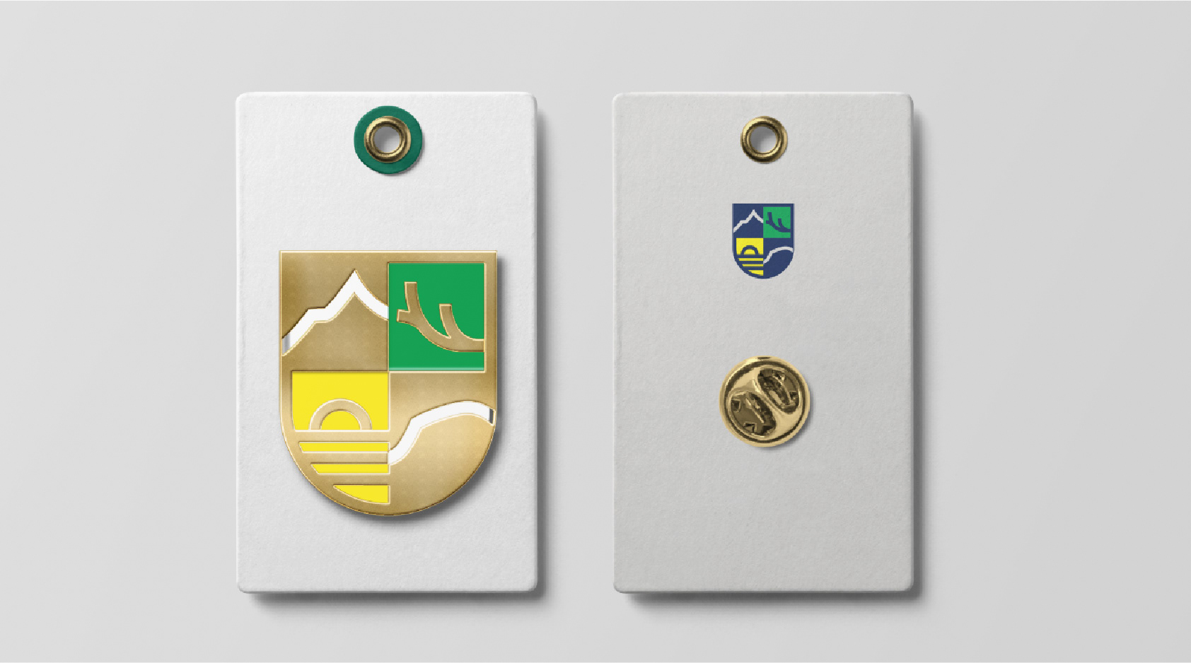
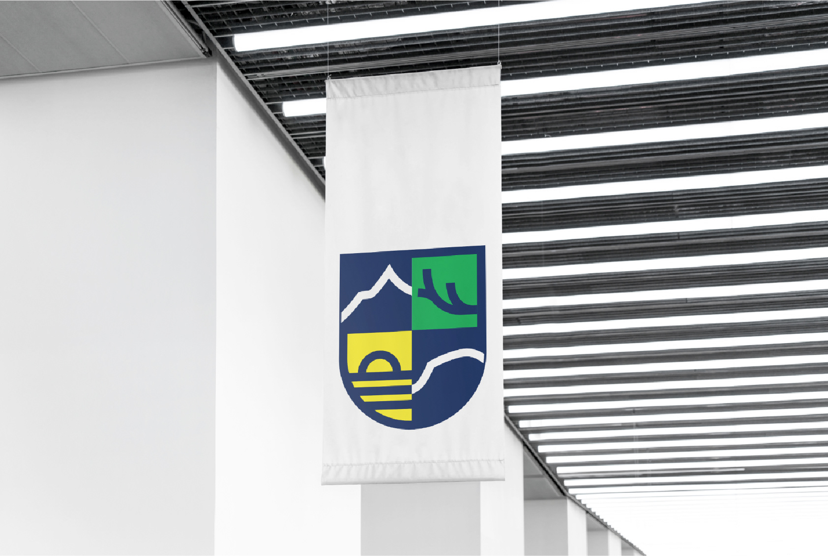
New coat of arms of the merged municipality of Múlaþing in Iceland. At a meeting of the local council of Múlaþing, the proposal of an adjudication committee was approved, which was appointed for regional signs for the municipality.

The jury's opinion on the brand says: "The brand is modern and classic at the same time. It is presented in a four-part shield with strong, simple, symbolic lines. One quarter of the mark is the outline of Múlakoll, which is the foremost part of Þingmúli, which was one of the main meeting and parliament places of the East Fjords in ancient times, and the Múla counties are named after him. This is where the name of the new municipality lies. The second quarter of sign language is a kind of future symbol of the unborn, renewal and cycle. We look at the day bridge from Héraðsflói and Borgarfjörður eystri in the direction from where the sun rises. The third quarter is the corner of the reindeer, which symbolizes grandeur and majesty, intelligence and resourcefulness. It underlines the uniqueness of the area. The fourth is the peaks, the outcrops, the majestic mountain ranges of East Iceland, the outlines of Búlandstindur, could just as well be the holy Strandatindur with good will."

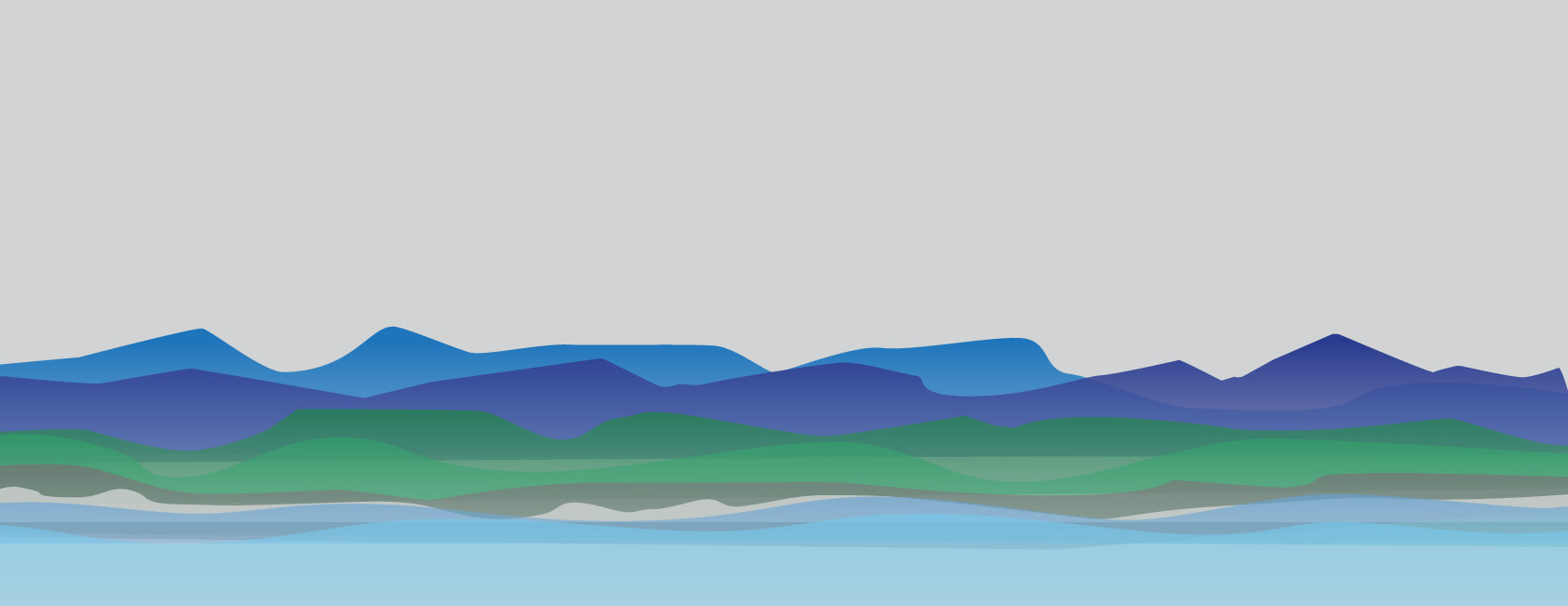
A simple graphic illustration of the coast line of Múlaþing.